Brand and style guide
The Calaca UI brand — marks, colors, type, iconography and the rules that keep it consistent in every context.
The brand in one line
One skeleton, many skins. Calaca UI is the layer of clothing a product puts on the same accessible skeleton. The brand carries that idea visually: paper and ink, marigold warmth, hand-drawn geometry, and a skeleton that is a face, not a threat. “Calaca” is Spanish for skeleton — the name is the system.
Philosophy
The brand rules mirror the system rules:
- Structure first, look second. The skeleton (a11y, focus, targets, behavior) never depends on a style choice. The brand must never imply the look is required.
- Skins are independent. Base, proof, crossview and your own skins are siblings; the Calaca brand is one of them. Never let Calaca marks leak into another skin’s demos.
- Native and honest. Plain HTML, plain classes, no framework lock-in. The brand voice is equally plain: say what it does, show it working.
- Enforced, not agreed. Where a rule can be mechanical (tokens, tests, generated assets), it is. This guide is the part that lives in your head.
- Nothing hidden. The skeleton is a feature, not a secret: Show skeleton undresses the whole site, chrome included.
The marks
Three assets, each with a job:
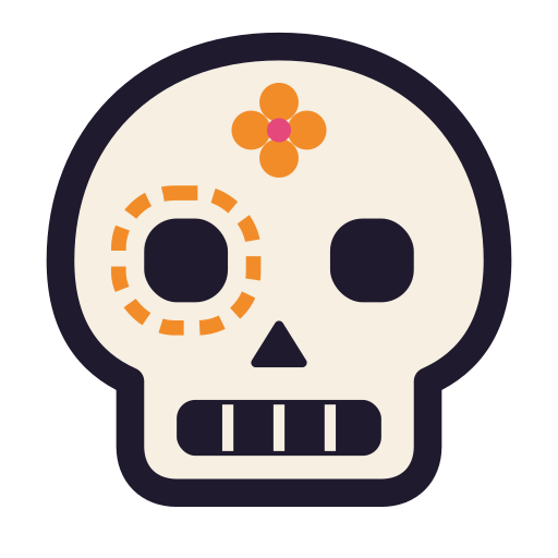
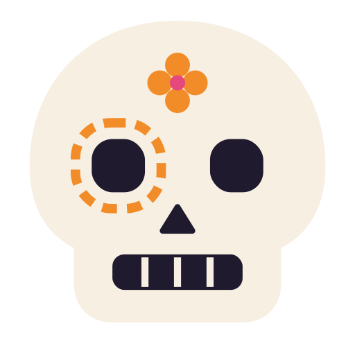
calaca-ui-mark.svg— the skull alone. App icons, navbars, social avatars. Comes in light, dark (-mark-dark) and mono (-mark-mono) variants.calaca-ui-avatar.svg— the skull on a full-bleed sheet. Avatar images; the sheet is square on purpose so a skin’s radius owns the shape.calaca-ui-logo.svg/-stacked/-dark— the lockup for headers, covers and slides.
The wordmark
Set as calaca + the marigold ui pill, never as one styled word:
- Always lowercase —
calaca, notCalaca. Set in the display face, black weight. - The pill: marigold fill, 2px ink border,
2px 2px 0ink offset shadow, rotated −4°, ink text. - It is an image treatment, not a
uisuffix: never write “calacaui”, “CalacaUI” or “Calaca-UI”.
Rules for the skull
- Keep the intrinsic asymmetry: the dashed eye socket and the flower are part of the mark.
- The avatar sheet stays square. Roundness comes from the container (
ca-avatar), never from re-editing the file. - Allowed tilts: −4° (pill, labels) and −6° (corner marks). Nothing else.
- On dark, use the
-darkvariants; never invert the light file.
Color
Five brand constants, in --site-* for chrome and --ca-* tokens for the calaca skin:
| Color | oklch | Role |
|---|---|---|
| Tinta ink | oklch(23.38% 0.0383 294.75) |
Text, borders, outlines, code background |
| Hueso bone | oklch(95.41% 0.0188 83.06) |
Page ground, ink text on dark surfaces |
| Cempasúchil marigold | oklch(73.49% 0.1613 58.77) |
Primary accent: fills, pills, the flower |
| Rosa | oklch(63.53% 0.1956 5.33) |
Secondary accent, small marks |
| Jade | oklch(63.08% 0.1064 182.69) |
Tertiary accent, sparing |
Usage rules:
- Ink is the worker. Borders, text, shadows are ink — not grey approximations.
- Marigold is a fill, not a text color. Ink text on marigold (≈6.9:1); never marigold text on bone.
- Rosa and jade accent sparingly — small flowers, status, one element per view, never large fills.
- Code always sits on ink with bone text, in both appearances.
- The color strip (bone 45% · ink 30% · marigold 15% · rosa 5% · jade 5%) closes brand pages; keep the proportions.
Typography
- Display/body: Nunito. Headlines at
font-weight: 900withletter-spacing: -0.02em; body at regular/medium. Text wrapsbalanceon headings,prettyon paragraphs. - Mono for labels. Eyebrows, field labels, meta text: font-mono,
0.7–0.75rem, uppercase,letter-spacing: 0.12–0.14em. - No other faces. A skin changes
font-familythrough--ca-font-*tokens; the brand itself uses Nunito everywhere. - Sizes come from the
--ca-type-*ramp — pick the named step, never a pixel value.
Geometry and elevation
Calaca’s signature is playful but mechanical:
- Borders are 2px ink on surfaces (
border-strong); 1px is for hairlines and dividers only. - Shadows are hard offsets —
3–8pxat0pxblur in ink or pigment. Never soft glows, never gradients of shadow. - Radii are generous — controls and cards round through
--ca-radius-control/--ca-radius-card; pills go999px. - Dashed means staging. Preview trays, dropzones and documentation frames use a dashed hairline — it reads as scaffolding, not chrome.
Iconography
- Stroke icons only:
stroke="currentColor",stroke-width2–2.5, round caps and joins. - Grids of 16 or 24 viewBox; sized with
size-4utilities. - Icons are semantic (sun, moon, half-circle for system) or decorative (
aria-hidden), never both. The skull is the mark — don’t invent other mascots.
Brand devices
- Eyebrow: numbered marigold pill (1.5px ink ring, ink digits) + uppercase mono label.
- Corner mark:
<Calaca />in small mono, top-start of hero panels. - Skull favicon:
favicon.svgis the mark alone — no pill, no text.
Using the brand in other contexts
- Inside other skins: the calaca mark appears only in calaca-dressed contexts. Docs and marketing may show it regardless of the worn skin; product UI in another skin uses that product’s own marks.
- Docs site chrome: neutral staging (hairlines, dashes) may frame any skin; brand devices stay calaca.
- Partner/product pages: give them their own wordmark and pill colors via
--site-*overrides — do not recolor calaca’s. - Don’t: redraw the skull, add gradients, soften the offset shadows, capitalize the wordmark, or pair the mark with non-Nunito type.